Project Name
Dimenso
Focus
Technical UI Designer / Frontend Developer
Tech Stack & Tools
Blazor, Git, Tailwind CSS Methodology, Figma

Dimenso Central unifies accommodation and catering logistics into one platform. I designed and coded the frontend using customized Blazor component libraries, delivering a seamless, role-based dashboard for central administration, inventory purchasing, and meal management.
Explore Prototype
The Problem
The engineering team behind Dimenso Central-a Brno-based platform unifying catering and accommodation logistics - had built a powerful backend, but needed a frontend interface to match. The core UX challenge was translating highly complex data into a usable dashboard. Administrators required a streamlined tool to oversee central purchasing, nutritional registers, and multi-facility operations without suffering from cognitive overload.
- Payments History
- Previous Payment
- Accommodation History
- Previous Accommodation
- Current Booking
- Extend Booking
- Cancel Booking
- Report issue
- Profile Settings
- General Settings
- Users List
- User Details
- Rooms List
- Room Details
- Issues List
- User List (registered)
-
- Backup Service
- Power Apps Configuration
- Apps List
- Add / Remove App
-
- System Monitor
- Customers List
- Customer Details
- Security Settings
-
Information Architecture
To translate the tripartite ecosystem into a functional product, I mapped a comprehensive Information Architecture. I utilized a nested directory approach to ensure each persona—the Student (Purple), the Hostel Admin (Green), and the Platform Admin (Red)—had isolated, frictionless navigation paths stemming from a unified global entry point.
Mapping a Tripartite Ecosystem
The Dimenso platform required an architecture that could accommodate three distinct user archetypes. While I mapped the macro-journeys for all three to ensure system-wide cohesion, I ultimately focused my deep-dive UX and UI prototyping on the most operationally complex experience: The Hostel Owners.

Martina Janíčková
The busy student"Being a student means constantly juggling classes, work, and a social life. Some days, it feels impossible to stay on top of everything and still have time for myself."
Bio
Martina juggles classes, work, and social life, relying on Dimenso for quick food orders, last-minute stays, and campus services—all from her phone. Always on the lookout for deals, she shares reviews and tips to help fellow students get the best experience.
Goals
- Book rooms fast and reliable
- Be on top of everything that is going on in the campus life.
Pains
- Clunky UIs makes her waste time.
- Misses important events going on campus.
- Has difficulties keeping tabs on every app.
Devices

Lukáš Čáp
The almighty Admin"I make sure everything runs smoothly—efficient setups, secure systems, and zero friction for users. If there’s a smarter way to do it, I’ll find it."
Bio
Lukáš ensures smooth onboarding and system management as a platform administrator. Tech-savvy and detail-oriented, he configures customer accounts, monitors system performance, and maintains security standards. With a structured and proactive mindset, Lukáš values automation and efficiency, ensuring a seamless experience for users while keeping operations running flawlessly.
Goals
- Streamline onboarding to make customer setup faster and more intuitive.
- Maintain a secure and stable system with minimal downtime.
- Provide proactive monitoring and troubleshooting to prevent issues.
Pains
- Reducing onboarding friction for new customers while maintaining accuracy.
- Struggles with a clunky UI that slows down account setup and management.
- Balancing automation with the need for hands-on troubleshooting.
Devices

Miloš Horák
The Hostel Admin"Every hour spent on repetitive tasks is an hour lost from meaningful progress. Streamlining operations isn't just about efficiency—it's about freeing up time for what truly matters."
Bio
Miloš is dedicated to efficiency and precision in university operations. He streamlines user account management, billing, and compliance while minimizing administrative overhead. Known for his calm, analytical approach, he values clarity and structure in both work and life.
Goals
- Handle the needs of users fast and with less manual work
- Create reports on university expenditures.
- Improving billing accuracy to prevent errors and delays
Pains
- Manual processes eat up too much of his time
- Misses important alerts on accommodation issues
- Struggles to effectively manage hundreds of users
Devices
User Journey Map - Martina Janíčková
Goal: Book a room in a hostel fast
| Stages |  Researching options Researching options | Creating account | Searching for the perfect room | Booking the room | Paying the deposit |
|---|---|---|---|---|---|
| Actions | Accesses the Dimenso portal by clicking the link in her onboarding email sent by the University. | Creates account using her uni email. | Navigates to My Profile screen and looks for the search bar to find a vacant room. Finds the search icon and taps to reveal the search bar. | Finds the list with vacant rooms. Opens the first few and after three tries decides to choose the second one. | Opens the payment gateway and is presented with payment options: Pay by card, Bank Transfer. |
| Touch Points | Smartphone → Email app on her phone | Smartphone → Dimenso home page | Smartphone → My Profile screen | Smartphone → Booking screen | Smartphone → Payment screen |
| Pain Points | ------------------- | She needs to create a new account and come up with a strong password. | She is greeted by an empty screen and is forced to go look for other options. | She doesn't know what room is better for her needs so she just opens them one by one to find the right one. | She doesn't know what are the different caveats of payment options. |
| Opportunity | ------------------- | Suggest a strong password. Make it possible to register by phone number so the user gets to use the app straight away. | Add one or more suggested actions upon profile
registration: - Add first booking - Find your perfect room | Add filters to the rooms list. Also a possible improvement can be adding icons to room cards like: current occupancy, floor number. | Add a disclaimer under each option stating their processing
time: - Instant for card payment - 2-3 days for Bank Transfer Add option to pay by QR code. |
| Experience | |||||
User Journey Map - Miloš Horák
Goal: Set up "Payment due" auto notifications
| Stages | Log In & Navigate | Define Recipients | Schedule Triggers | Customize Message | Test & Activate |
|---|---|---|---|---|---|
| Actions | - Logs into Dimenso dashboard - Navigates to "Notifications" section | - Filters students by payment due dates (e.g., "Due in 3
days") - Selects bulk list | - Selects "Days Before Due Date" - Inputs "3" and "1" days - Assigns time (e.g., 10 AM) | - Uses template: "Rent Due Reminder" - Edits message, adds payment link | - Sends test to self/team - Confirms automation is active |
| Touch Points | Laptop → Dimenso dashboard → "Automations" tab | Laptop → Dimenso student management → Filters | Laptop → Trigger setup modal | Laptop → Dimenso message editor | Laptop → Dimenso "Test & Activate" modal |
| Pain Points | - "Automations" buried under multiple menus | - No preset filters for due dates - Can't save student groups for reuse | - Manual entry feels tedious - No error prevention (e.g., negative days) | - No auto-translate for international students | - No confirmation of active automations |
| Opportunity | Add a "Quick Actions" panel with shortcuts (e.g., "Create Reminder"). | Add preset filters (e.g., "Due in 3 days," "Due tomorrow") + "Save Group" feature. | Add dropdown presets (3, 1, 7 days) + input validation. | Provide templates with dynamic fields (e.g., {name}, {amount}) + preview mode. | Add a status badge (e.g., "Active: Sending on Day 3 & 1"). |
| Experience | |||||
User Journey Map - Lukáš Čáp
Goal: Onboard a new university onto the platform
| Stages | Initiate Setup | Enter Basic Info | Configure Settings | Review & Confirm | Finalize & Notify |
|---|---|---|---|---|---|
| Actions | - Logs into Dimenso dashboard - Clicks "Add New Customer" | - Fills institution name, admin contact, region - Uploads institution logo | - Sets up payment gateway (Stripe/PayPal) - Defines user roles for the institution | - Checks summary of settings - Confirms or edits details | - Clicks "Submit" - Sends welcome email to the institution's admin team |
| Touch Points | Laptop → Dimenso dashboard → "Customers" tab | Laptop → Dimenso onboarding wizard (Step 1) | Laptop → Dimenso onboarding wizard (Step 2) | Laptop → Dimenso onboarding wizard (Step 3) | Laptop → Dimenso confirmation modal |
| Pain Points | - "Add New Customer" button is buried in menus | - No bulk-upload for multiple customers - Unclear error for invalid formats (e.g., logo size) | - Repetitive form fields - No templates for common setups | - No side-by-side comparison with existing customers - Missing "Save Draft" option | - No confirmation of email delivery - No option to schedule onboarding |
| Opportunity | Add a prominent "+ New Customer" button on the dashboard. | Add real-time validation + error hints (e.g., "Logo must be <5MB"). | Add pre-built templates (e.g., "Default University Setup") + copy-paste previous configs. | ------------------- | Add a "Test Notification" button + scheduling for go-live dates. |
| Experience | |||||
User Journey Mapping
To uncover friction points across the tripartite system, I mapped the critical path for each persona. By overlaying touch points, pain points, and the emotional experience curve, I identified specific design opportunities that would ultimately drive the UI architecture.
The Process
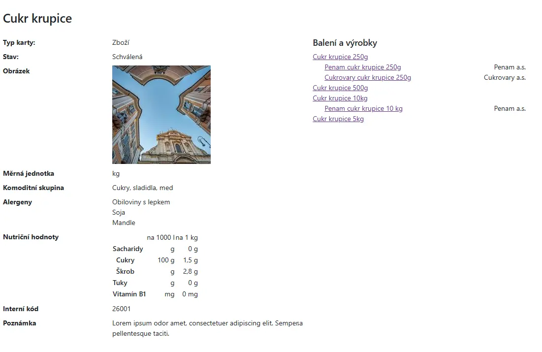
A Crisis of Information Hierarchy
Before the redesign, the Dimenso frontend struggled to present dense catering and inventory data effectively. The legacy UI suffered from several critical usability issues:
- Flat Visual Hierarchy: Lacks a defined typographic scale. Primary titles and secondary internal codes compete equally for the user's attention..
- Poor Spatial Grouping: Arbitrary whitespace between labels and values violates Gestalt principles, forcing excessive eye movement and increasing cognitive load.
- Unstructured Relational Data: Complex, nested information (e.g., nutritional values, vendor packaging) is dumped into flat text blocks and unstyled links instead of structured tables or data cards.
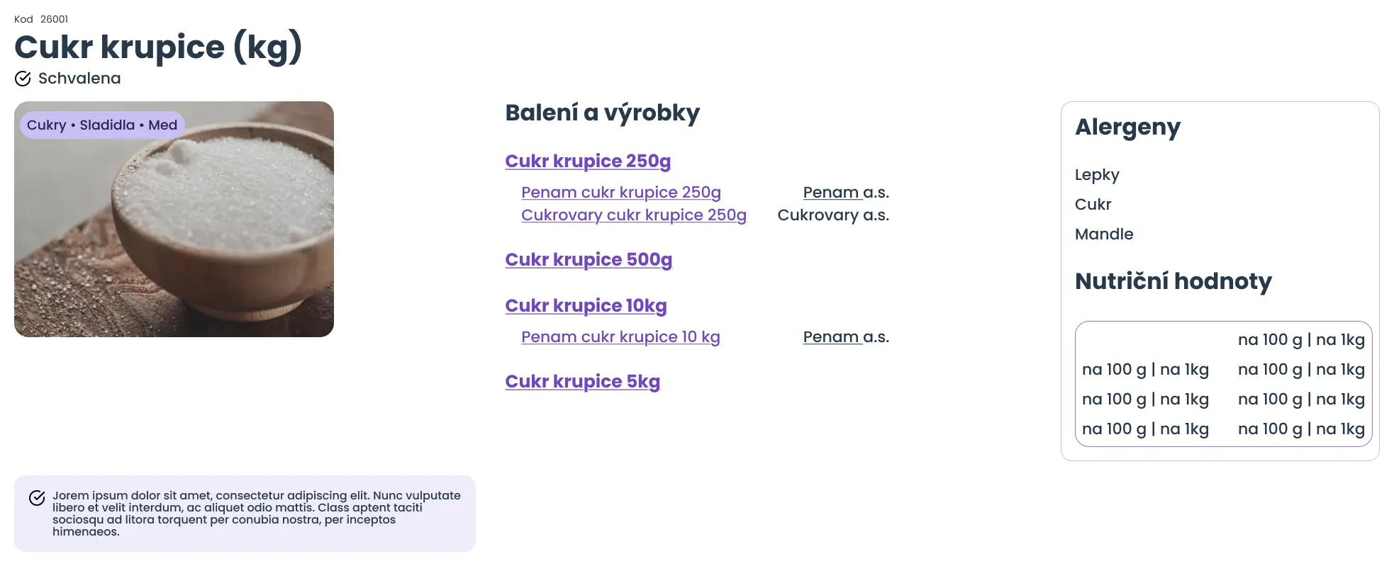
1. Structuring Complex Data (UX)
Before writing any code, I had to untangle the relational data. I designed dashboard layouts that prioritized critical daily tasks—allowing hostel staff to instantly cross-reference available products, track vendor stock, and manage meal allocations based on guest diet types. The goal was to reduce cognitive load and minimize clicks for high-frequency actions.
Cukr krupice (kg)

Balení a výrobky
Alergeny
- Lepky
- Cukr
- Mandle
Nutriční hodnoty
Lorem ipsum dolor sit amet, consectetur adipiscing elit. Nunc vulputate libero et velit interdum, ac aliquet odio mattis.
First things First
The foundational step was completely remapping the flow of information. By establishing a strict visual hierarchy, I transformed unstructured, overwhelming data into highly scannable product cards—ensuring users never feel lost while navigating complex inventory logistics.
Brand
Semantic Implementation Pipeline
Here comes the colors
By mapping logo-derived color primitives to a Tailwind scale (50-950), I established a core palette that fed directly into our semantic token architecture. This multi-layered abstraction—from raw hex, to core primitive, to functional component—created a 1:1 sync between Figma variables and CSS, dramatically accelerating development.
2. Designing Within Technical Constraints
The client required the use of a specific, pre-made Blazor component library. Instead of fighting the framework, I embraced it. I established a custom design token system mapped perfectly to Tailwind CSS conventions (e.g., utilizing functional scales like primary-50 to primary-900). This approach allowed me to heavily customize the off-the-shelf Blazor components, transforming a generic library into a cohesive, branded interface that felt bespoke.
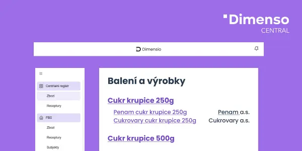
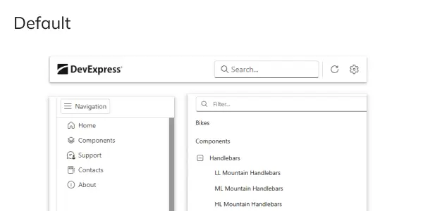
An example of how I customized the default DevExpress component and futureproofing by changing the global theme variables
Constraints? Not a Problem!
I designed and customized the UI using the mandated DevExpress Blazor library. To future-proof the frontend against framework updates, I used a minimal-override strategy—mapping Tailwind CSS tokens to global theme variables, utilizing native SizeMode settings for density, and safely targeting wrappers via Blazor's CSS isolation. For any unavoidable deep overrides, I embedded explicit developer comments to ensure seamless maintenance during future version upgrades.
3. Frontend Development & Collaboration (Engineering)
This was a highly collaborative, code-heavy engagement. I didn't just hand off Figma files; I actively coded the frontend UI representations using Blazor. By integrating directly into the client's engineering workflow, I pushed UI updates and component customizations through their Git repository, ensuring the frontend stayed perfectly in sync with their backend development cycles.
The Outcome
I successfully bridged the gap between the client's raw backend data and the end-user experience. By delivering a customized, scalable Blazor frontend and collaborating seamlessly via Git with the local engineering team, I provided hostel administrators with a powerful, intuitive tool to manage their daily operations.