Project Name
Bazinga AI
Focus
Architecting UX. Engineering UI.
Tech Stack & Tools
Figma, Blazor, Tailwind CSS
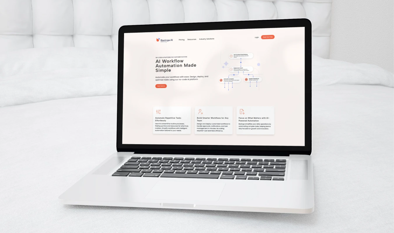
Designed and developed the Bazinga AI platform end-to-end. I built the foundational brand identity and marketing website, then leveraged that design system to architect the core web app—transforming a complex AI assistant configuration process into an intuitive, seamless user flow.
Live site
The Problem
Building a custom AI assistant is often an overwhelming, highly technical process that alienates non-developer users. Furthermore, many AI startups suffer from fragmented user journeys where the marketing site looks completely disconnected from the actual software. Bazinga AI needed a unified, intuitive experience that guided users seamlessly from discovering the product to successfully configuring and deploying their own AI agents.
The Process
1. Visual Identity & Design System Foundation
Before touching the complex application logic, I established the core brand language. I developed the logo and brand book, but rather than treating them as static graphic assets, I immediately translated them into a scalable UI design system. By defining global design tokens (typography, color variables, spacing), I ensured visual consistency across every future touchpoint.
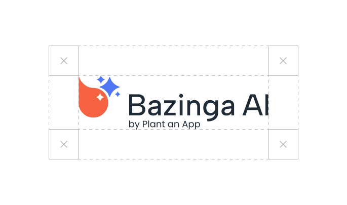
It all starts with a logo
A strong logo is simple, memorable, and versatile, ensuring it resonates with the audience across various platforms and mediums. Bazinga's logo represents a stylized chat bubble and the instantly recognizable AI magic star
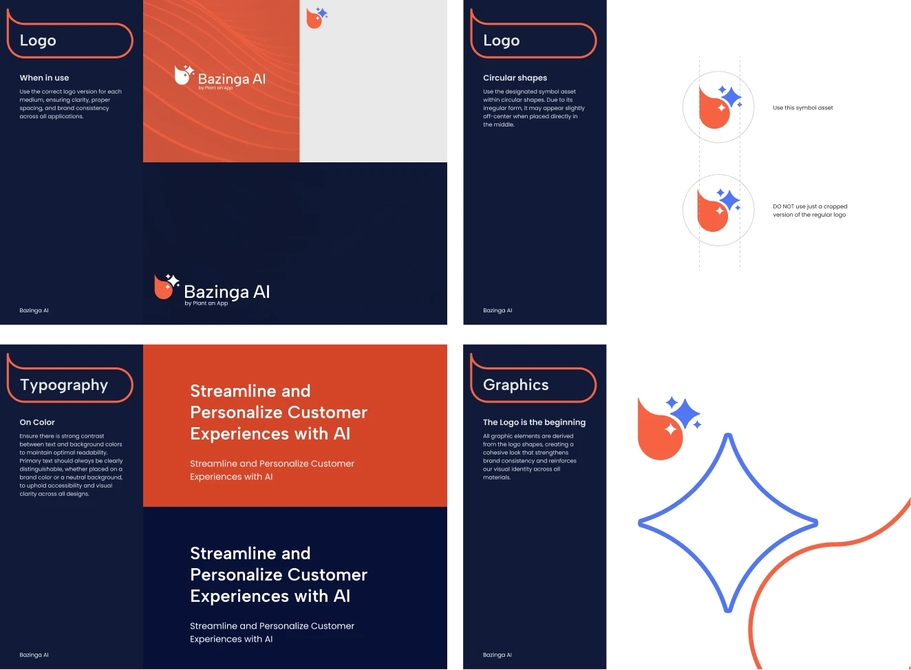
Base element for the brand identity
All graphic elements are derived from the logo’s shapes, creating a unified and recognizable design across all materials. This ensures that every visual detail—whether it’s icons, buttons, or backgrounds—feels intentional and aligned with the brand’s identity. By maintaining this consistency, the brand becomes more visually cohesive, reinforcing trust and recognition while making the user experience feel polished and seamless.
Color
I carefully crafted a color palette centered around orange and blue to make the brand feel more approachable, especially for non-tech audiences. Orange conveys energy, warmth, and creativity, while blue adds a sense of trust and professionalism—striking a perfect balance between innovation and reliability. Starting with these core colors, I systematically expanded the palette, ensuring harmony and consistency.
Tailwind CSS Palette
From the initial shades, I derived a comprehensive Tailwind CSS color system, defining variations for backgrounds, text, buttons, and accents. This approach provided scalability and flexibility, allowing for a visually cohesive experience across the entire platform while maintaining accessibility and contrast.
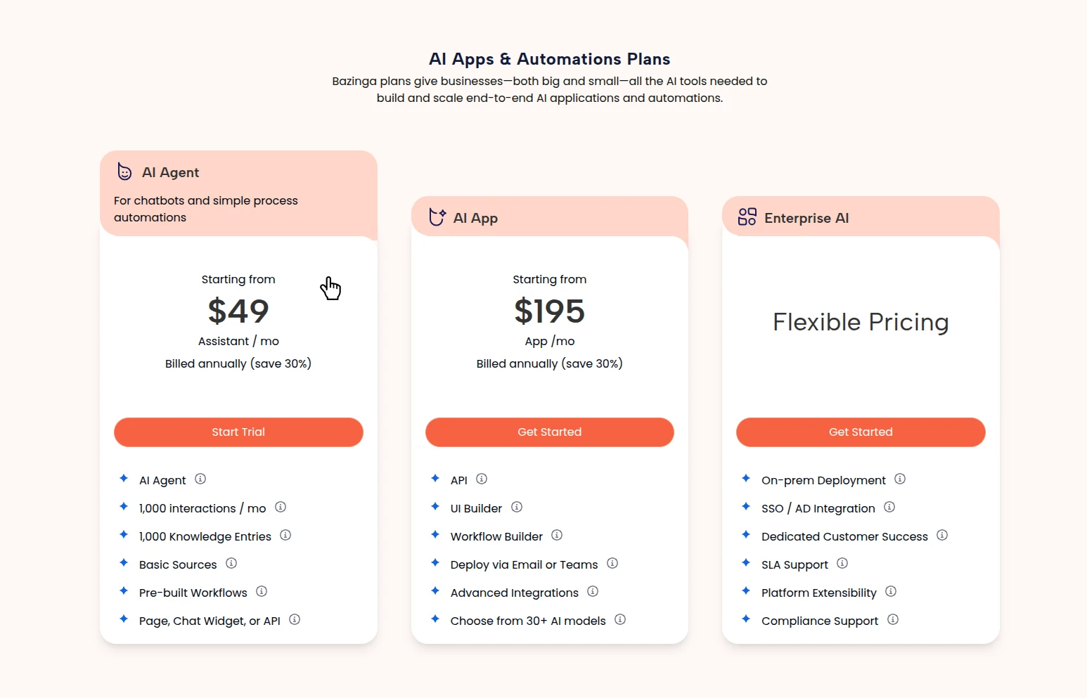
Expanding the style to UI elements
A major advantage of being both the brand designer and the UI/UX designer is the ability to create truly distinctive and cohesive user interfaces. This ensures that every element not only aligns seamlessly with the brand’s identity but also feels intentional, polished, and visually unique. By maintaining full creative control over both branding and UI/UX, I can design experiences that are not just functional, but also aesthetically compelling and instantly recognizable—giving the product a powerful competitive edge.
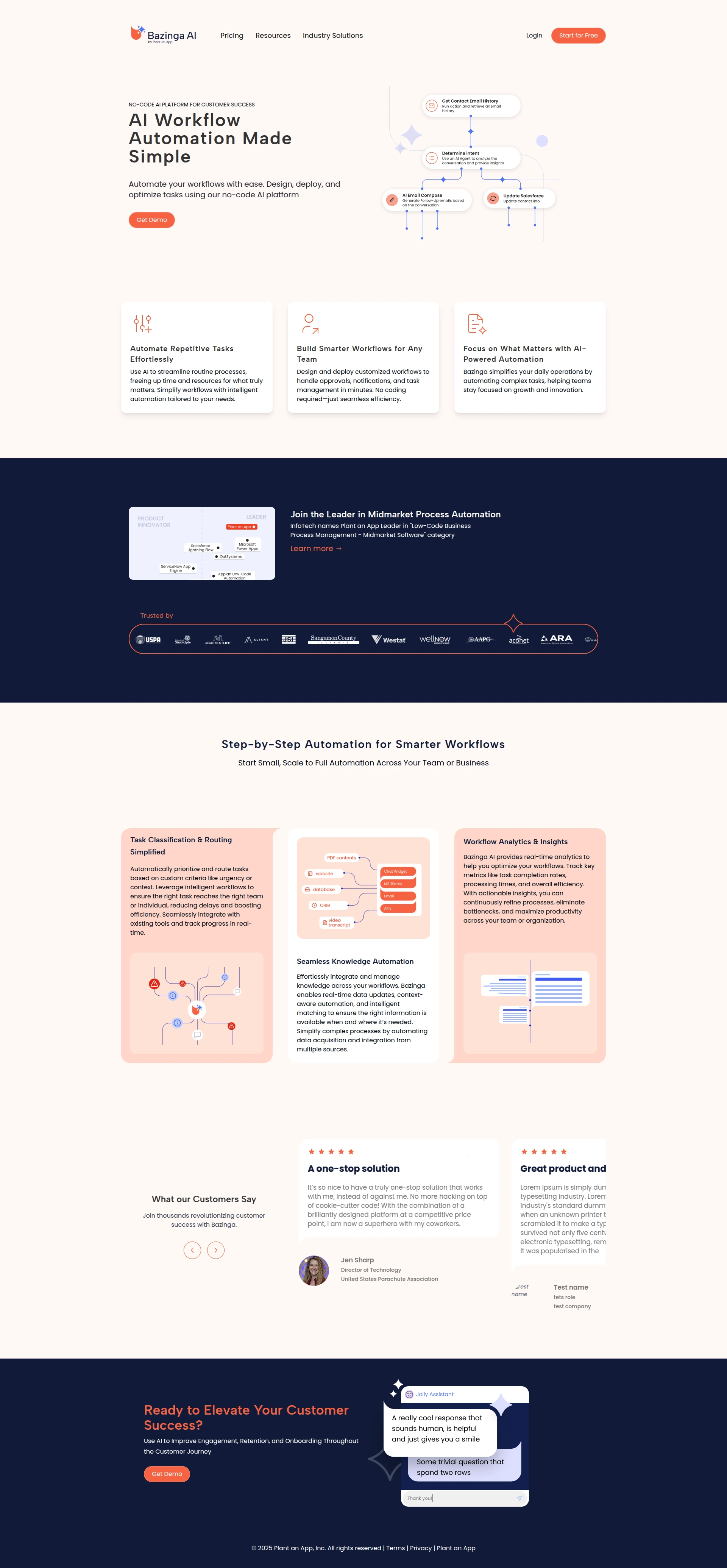
2. Marketing UI & Conversion Flow
With the design system in place, I designed the top-of-funnel web experience. The goal here was not just visual appeal, but conversion architecture—crafting clear messaging, intuitive navigation, and strategic calls-to-action designed to funnel visitors smoothly into the application's onboarding flow.
3. The Agent Creation Flow (Core UI/UX)
Restructured the application's information hierarchy to create an intuitive AI builder, translating deep technical complexity into a clear, user-centric interface
The Assistant Creation Flow
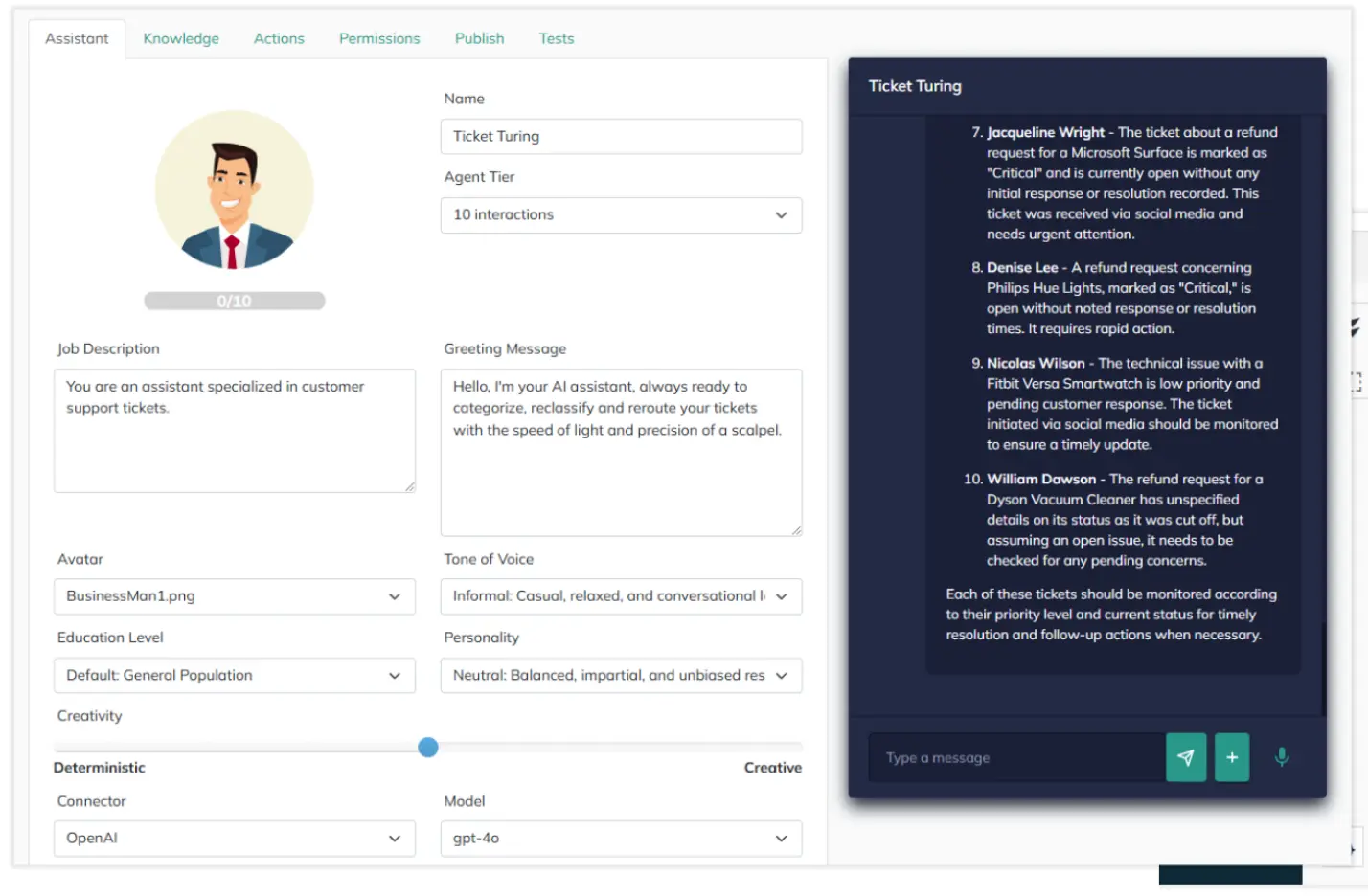
The original assistant creation flow suffered from fragmented information architecture and high interaction friction. Disconnected settings, ambiguous controls, and an off-brand preview created a confusing and tedious setup experience.
The "Before" Flow: High Friction
1. Start
Click "Create Assistant" on the dashboard.
2. Configure Identity
Select an avatar from a text-only dropdown menu.
UX Pain Point
Blind selection. Users cannot see what their bot looks like until later.
3. Set Parameters
Navigate a long, uncategorized page of ambiguous sliders.
UX Pain Point
Cognitive overload. Sliders lack explicit values or scales, forcing trial-and-error.
4. Save & Switch Context
Save the configuration and navigate away to a separate "Preview" page.
UX Pain Point
Broken feedback loop. Every adjustment requires leaving the editor to test.
The NEW Flow
-
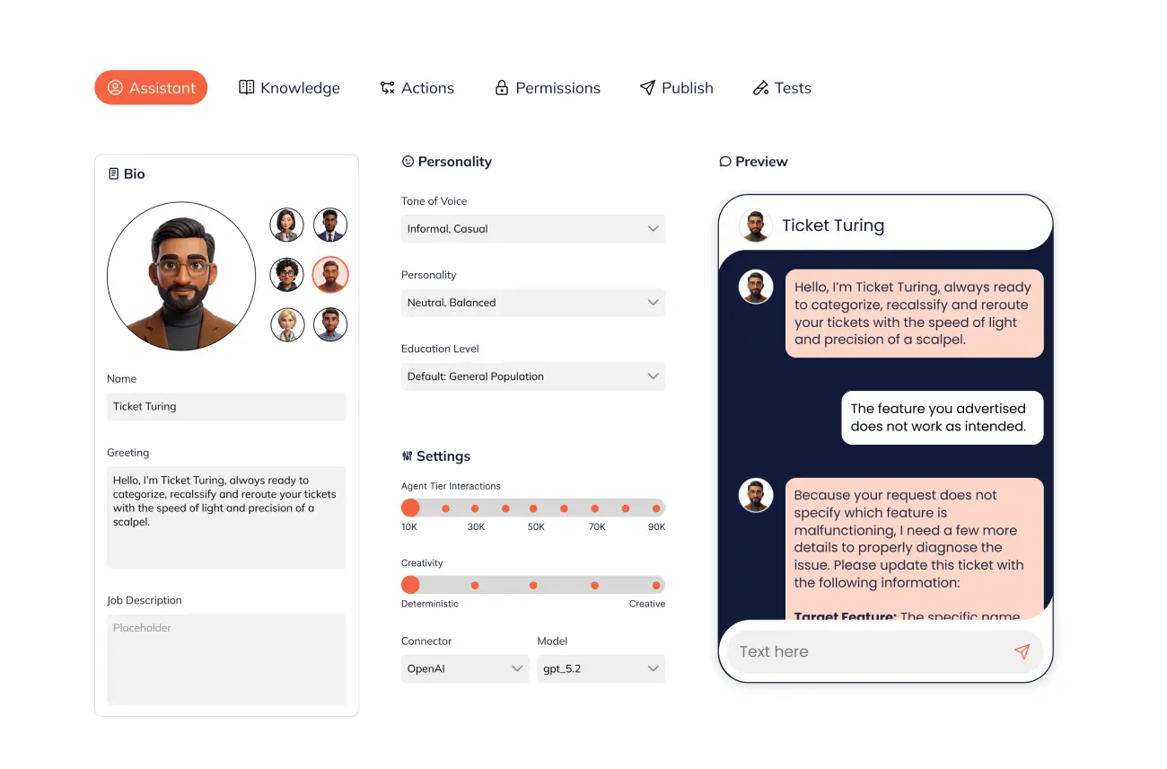
Consolidated Architecture: Grouped related settings into distinct, logical categories (e.g., Appearance, Behavior), reducing cognitive load and making navigation effortless.
-
Visual Avatar SelectionReplaced the clunky dropdown with an inline, visual avatar picker, allowing users to see and select their choices instantly. Precise
-
Configuration Controls Upgraded the sliders with explicit labels, values, and meaningful scales, eliminating guesswork and trial-and-error. High-Fidelity,
-
On-Brand Preview: Injected Bazinga AI’s core visual identity into the live chat window, creating a true WYSIWYG (What You See Is What You Get) feedback loop so users know exactly what they are building.
The "After" Flow: Streamlined WYSIWYG Experience
1. Start
Enter the unified Agent Builder workspace.
2. Define Appearance
Pick from an inline, visual avatar grid.
UX Win
Immediate visual recognition and brand alignment.
3. Configure Behavior
Adjust settings organized into logical tabs, using labeled sliders.
UX Win
Reduced cognitive load. Clear mental models replace guesswork.
4. Test in Real-Time
Interact with the persistent, on-brand chat window alongside settings.
UX Win
WYSIWYG feedback loop. Instantly validate changes without context switching.
Conclusion
I delivered a fully interactive, end-to-end Figma prototype and a comprehensive component library. By owning the process from the foundational branding all the way through to the complex application logic, I eliminated the typical friction between marketing and product design. The result was a cohesive, dev-ready system that allowed the engineering team to begin frontend implementation immediately without needing to guess at interaction states or design rules.